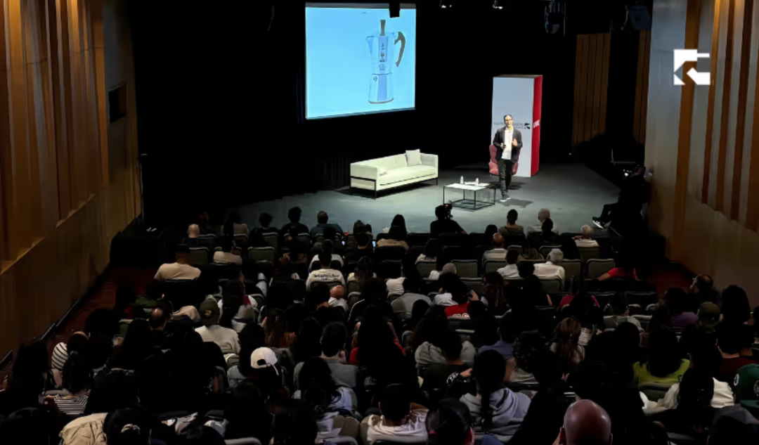
Travelers is a project developed within the Brand Management course of the Global Design Master’s program at DMAD Design School. Madrid, Spain.
Our daily lives move at a speed that exceeds our human and biological capacities. We start from the premise that the environment we have created evolves faster than we ourselves can. Therefore, talking about the near future is, in reality, talking about today. And this reality affects, without exception, all travelers.
Project TRAVELERS
Understanding how people travel today means understanding how they will behave tomorrow.
Travelers was born from that exercise: an observation and foresight project that takes current traveler behaviors as raw material to project new scenarios, new needs and, above all, new opportunities for applied strategic design, brand design, products and services.
How can a professional photographer fly without worrying about their equipment?
How can a person organize their vacation if they are not able to organize the photos on their own phone?
What are the truly important experiences for the new traveler?
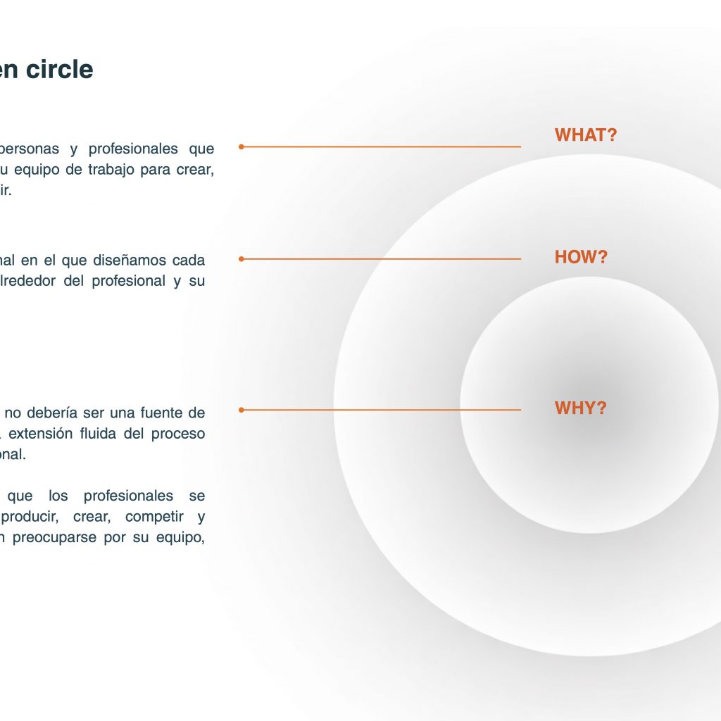
A brand is much more than a logo and a product. It is the set of experiences that a company is capable of orchestrating and offering. It is the tangible and intangible of a business model that builds relationships with its users (travelers) through coherent and meaningful touchpoints.
In the tourism sector, where traveler profiles diversify and emerging niches gain weight, this strategic view of the brand becomes a real competitive advantage and an exemplary 360º design exercise.
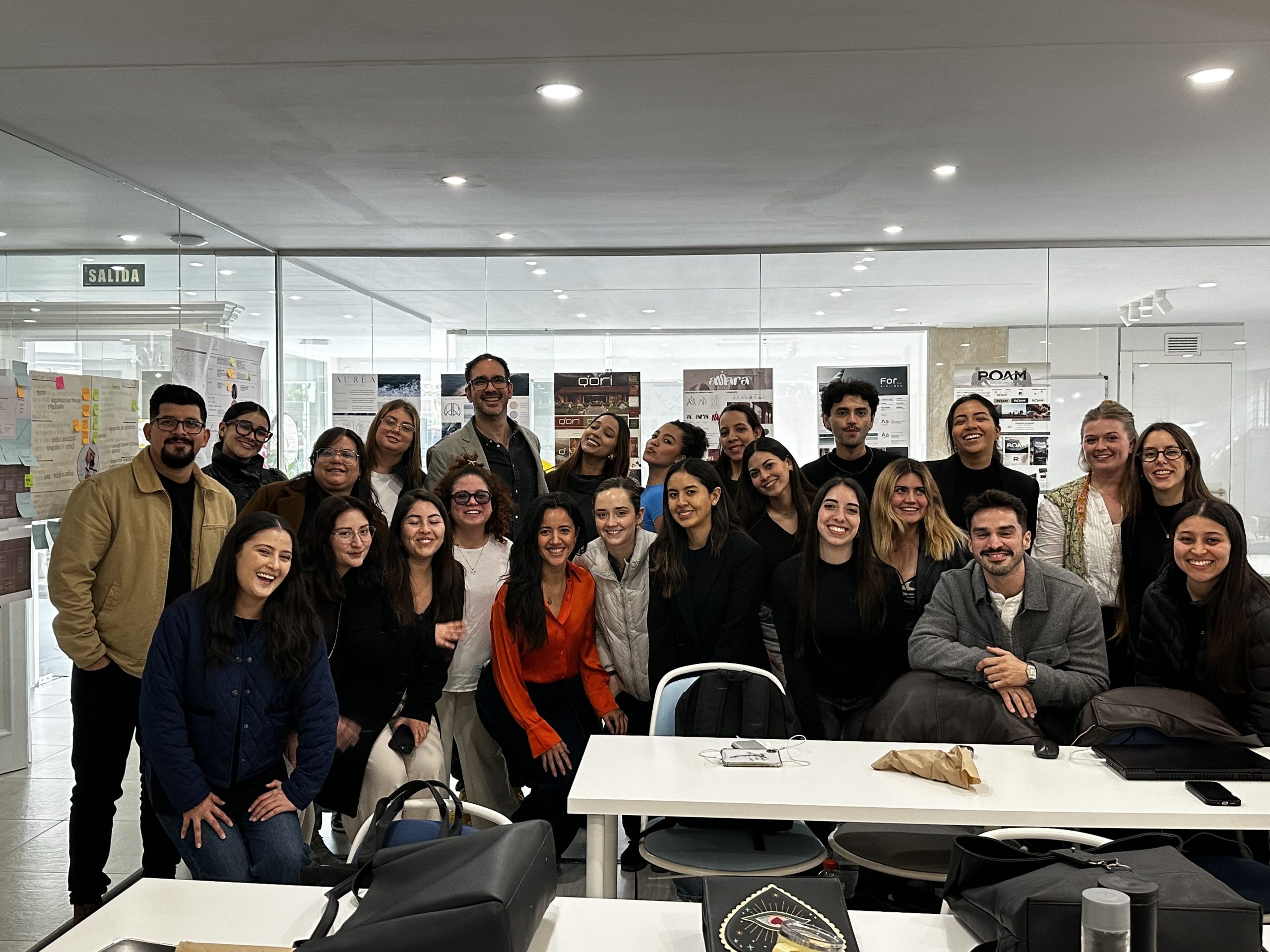
Under this premise, we have worked alongside 23 students (design and architecture), from the perspective and operational mode of a multidisciplinary design studio, with five working teams, to design five brands, five experiences and five businesses from scratch.
TRAVEL EXPERIENCE (TX Design)
The process is divided into two blocks of study and design: Strategic Design and Brand & Corporate Identity Design (Branding).
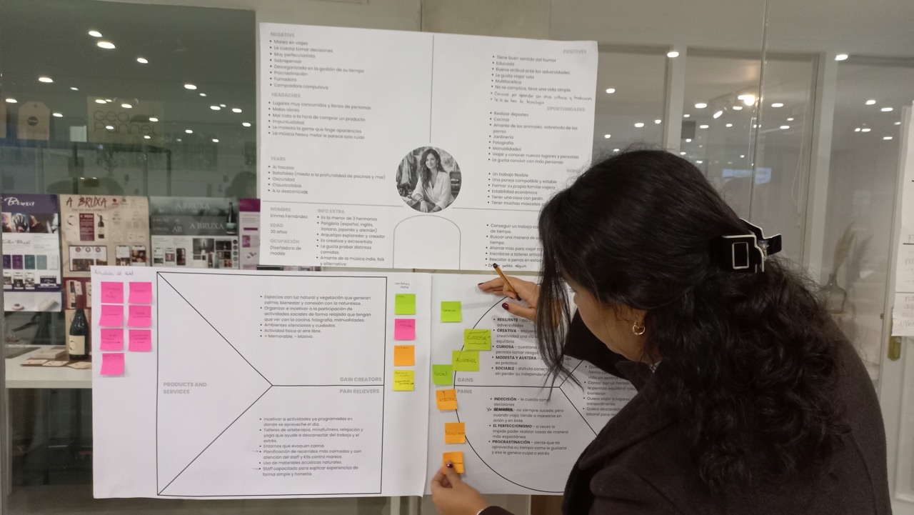
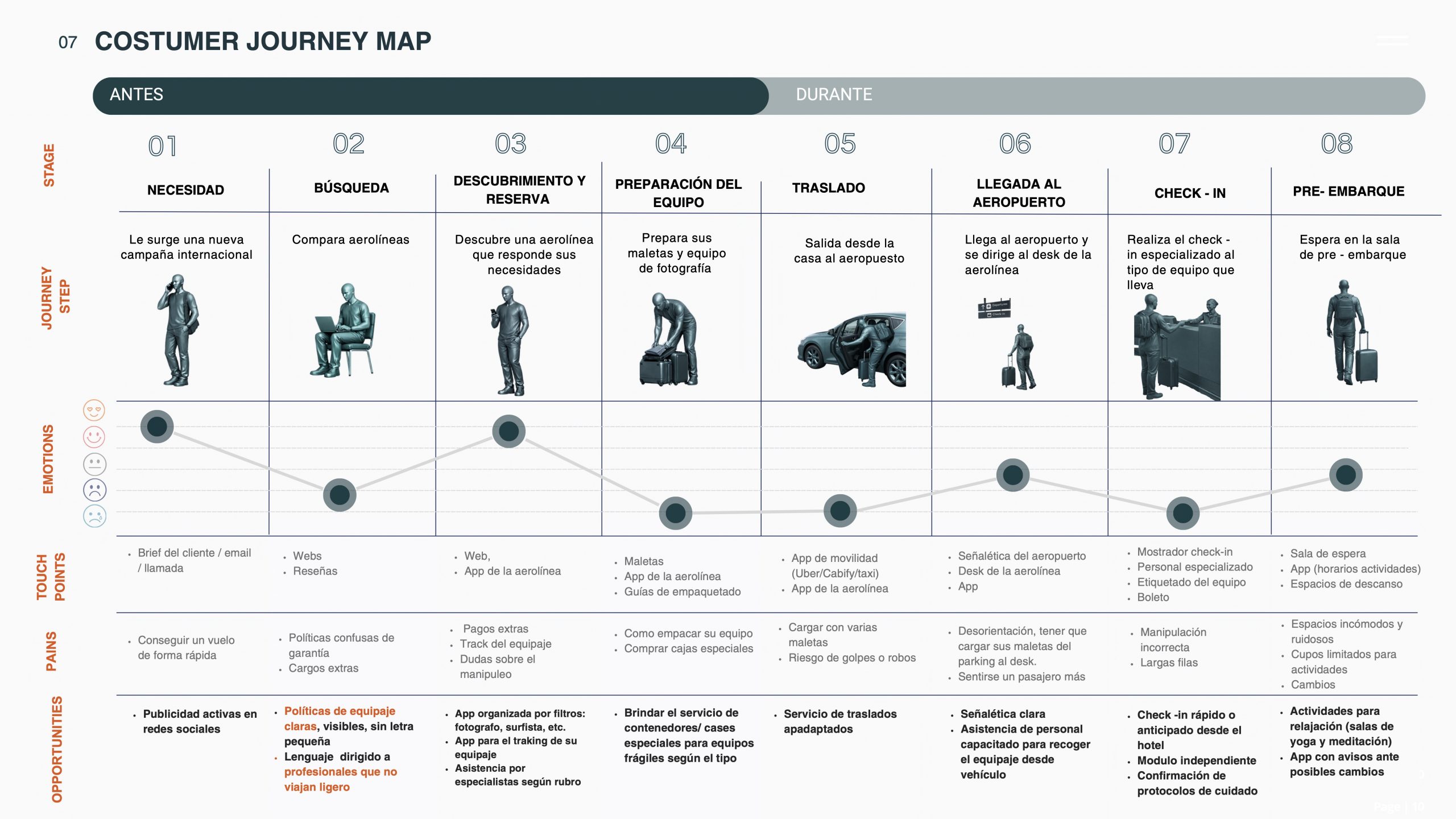
We began with an ethnographic approach, observing and mapping real behaviors, motivations and frictions of travelers. We identified their Gains and Pains to generate value propositions that shape an integral Traveler Experience. We defined very clear and high-impact touchpoints that form the DNA of the brands, from Naming to Branding development with visual identity systems applied to physical, spatial, digital and sensory formats.
The result was the design of five unique ecosystems. Five brands. Five business models for travelers. A platform to organize experiences, two hotels, an airline and a cruise line.
The TRAVELERS
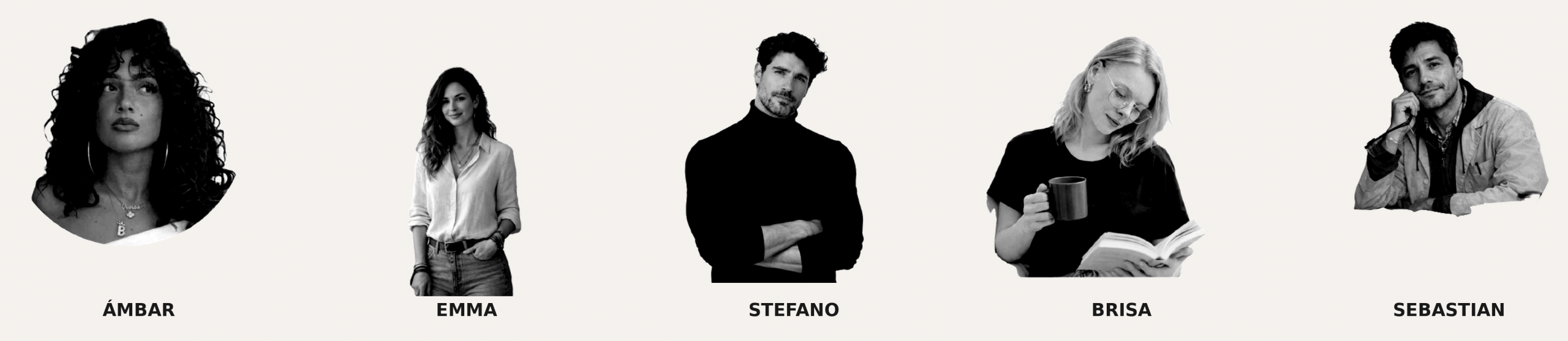
Five profiles. Five market niches. Five starting points for designing brands that respond to the real needs of real travelers.
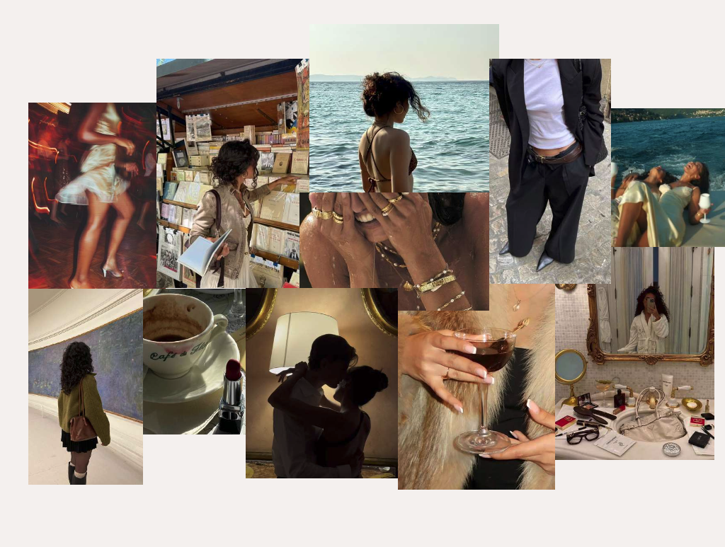
Ámbar is a Venezuelan model based in Madrid. She travels constantly for work and seeks, whenever she can, intimate luxury experiences and emotional reconnection. Her brand is AURÉA.
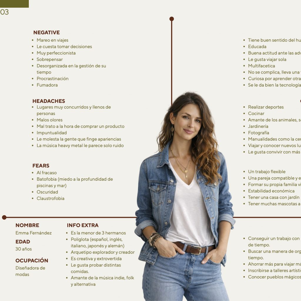
Emma is a fashion designer. She travels with a trained eye, looking for cultural references and authentic experiences that feed her creative practice. Her brand is Q`Ori.
Stefano is an Italian photographer. His equipment is his livelihood, and he needs an airline that understands that without negotiation. He only trusts FOR_.
Brisa is an architect. Demanding about spaces, she looks for something deeper than a destination when she travels. At aMara Lounge she finds the space to reconnect with herself.
Sebastian is a Colombian chemical engineer based in Copenhagen. He travels alone to remote destinations and trusts ROAM to design and manage every detail of the journey for him.
The Projects at a glance

aMara Lounge
aMara is a hostel conceived from and for women.
Its model is built on a clear idea: “reconnection with oneself”, which does not happen through extraordinary experiences, but through everyday rituals. Amara offers safe spaces, wellness activities and a sensory and creative curation of daily life that form a brand ecosystem transforming accommodation into a genuine process of personal flourishing.
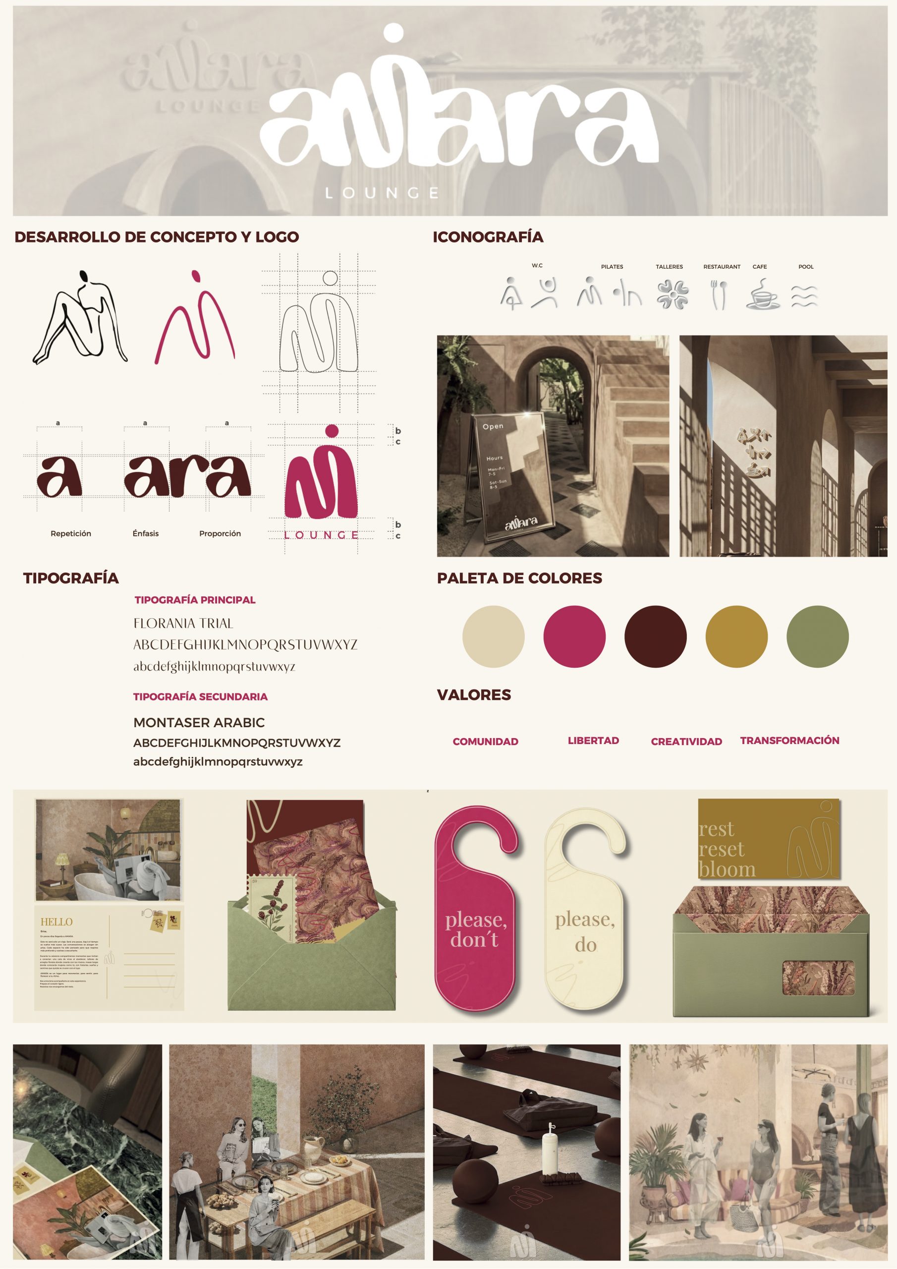
The visual ecosystem of aMara Lounge coherently translates its strategic proposition. The graphic identity, built on organic shapes that evoke the female body, a palette of warm earth tones, magenta and moss green, and a typeface with a handcrafted character, communicates its values. Community, freedom, creativity and transformation are not merely a declaration; they are encoded in every touchpoint, from the welcome sign to the door hangers, where “rest, reset, bloom” precisely sums up the arc of experience the brand proposes to the traveler.
The design of the aMara ecosystem demonstrates that a strong brand operates as a system: every piece, signage, packaging, service iconography, spaces, speaks the same language and reinforces the same promise. It was not a visual identity that was designed; it was a complete and livable experience.
For_
FOR_ is an airline built for professionals who travel with everything they need to create, compete and produce.
Its model is grounded in a single conviction: work travel should not be a source of friction, but a seamless extension of the creative and professional process. FOR_ exists so that professionals can focus entirely on producing, creating and executing, not on worrying about their equipment, logistics or baggage control. This strategic clarity shapes every design decision, from the aircraft interior (conceived as a mobile studio rather than a cabin), tailor-made logistic, personal attendance to a brand identity system that speaks the language of precision and professional purpose.
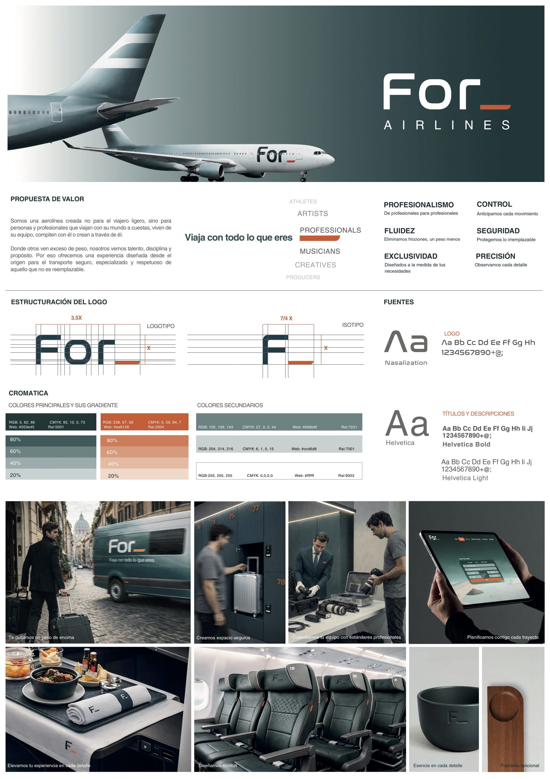
FOR_ is an airline designed not for the light traveler, but for the people who live by their tools, compete with them, or create through them. Every touchpoint, the spatial, visual, digital and sensory, is the result of a global design practice that treats the journey itself as part of the professional workflow.
The name carries meaning beyond the preposition. FOR_ draws from the concept of phoresis: to carry or transport something. This reinforces the idea that the airline does not merely move people, it carries talent, tools and projects in motion, acting as a support system that takes on your load and travels alongside your professional journey.
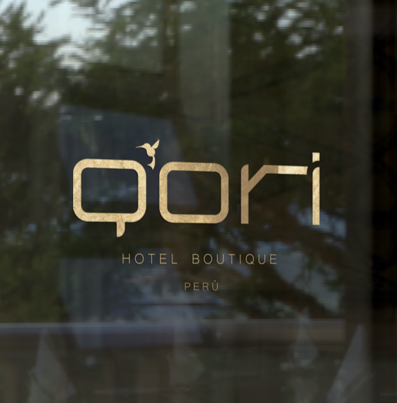
Q`Ori
Q`Ori is a Latin American boutique hotel chain that transforms travel into a journey guided by mystery and personal discovery.
Its model is built on a single premise: the traveler does not choose the destination. The destination finds them. Through a personalized travel profile, Q`Ori reveals the ideal place for each guest and crafts experiences that weave together local culture, nature and ritual in deep harmony with the territory. Each property is conceived as a contemporary sanctuary where lodging, gastronomy, artistic workshops and socio-cultural experiences converge into a single, coherent act of transformation.
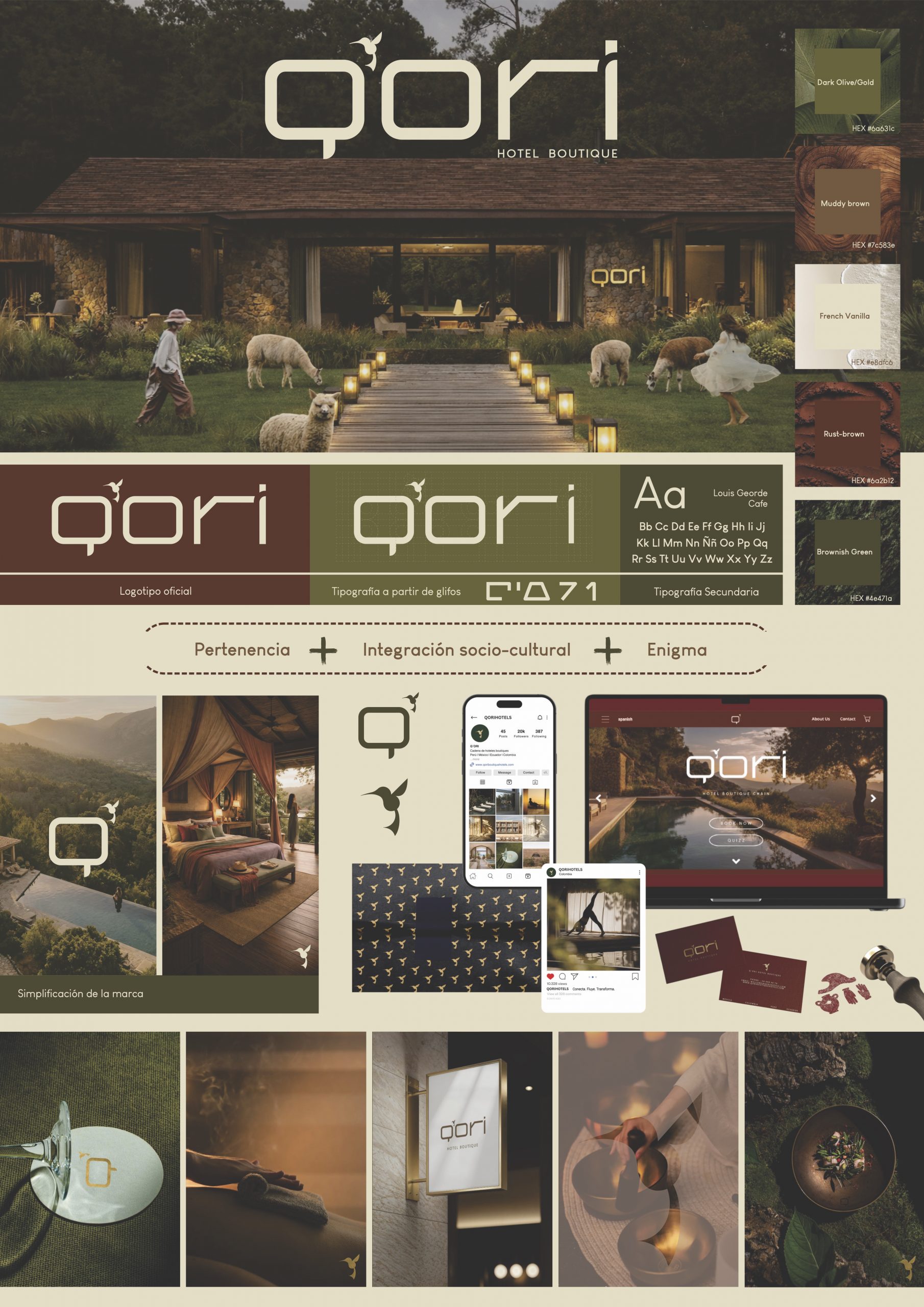
The strategic thinking behind Q`Ori extends into every layer of its design practice. The hummingbird (the brand’s guiding symbol) is not merely decorative; it embodies light travel, conscious movement and precision, a messenger between worlds that sets the tone for the entire brand system. This symbolic foundation shapes the spatial identity of the interiors, the sensory curation of each stay, and a proprietary typeface inspired by Quechua graphic systems, reinterpreting their curved and cylindrical forms into a fully functional visual language.
Every touchpoint, from the typographic system to the ritual of arrival, reflects a global design approach in which cultural rootedness and strategic clarity are inseparable. More than selling rooms, it offers belonging, reconnection and personal transformation, designed from the ground up as a living brand experience.
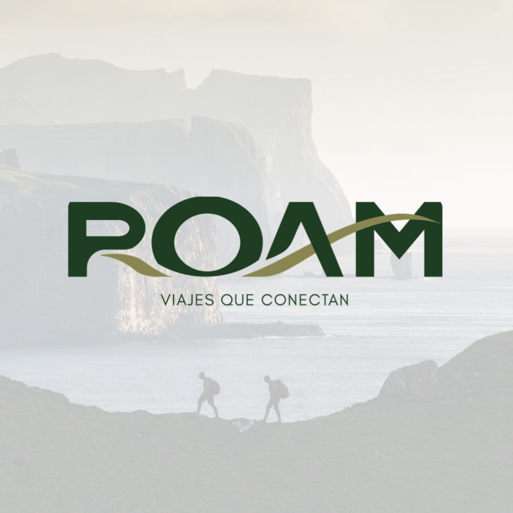
ROAM
ROAM is an experiential travel platform that designs complete journeys: flight, accommodation and itinerary, for travelers who seek the authentic over the ordinary.
Its model is built on a clear conviction: travel should not be an act of consumption, but one of conscious connection. ROAM promotes traveler autonomy, where every route is chosen with genuine freedom, and every experience is exclusive, authentic and unrepeatable, far from mass tourism, and rooted in real exchange with local communities. Each journey is designed as a whole, not assembled from parts, ensuring that remote and meaningful destinations remain accessible without losing their integrity.
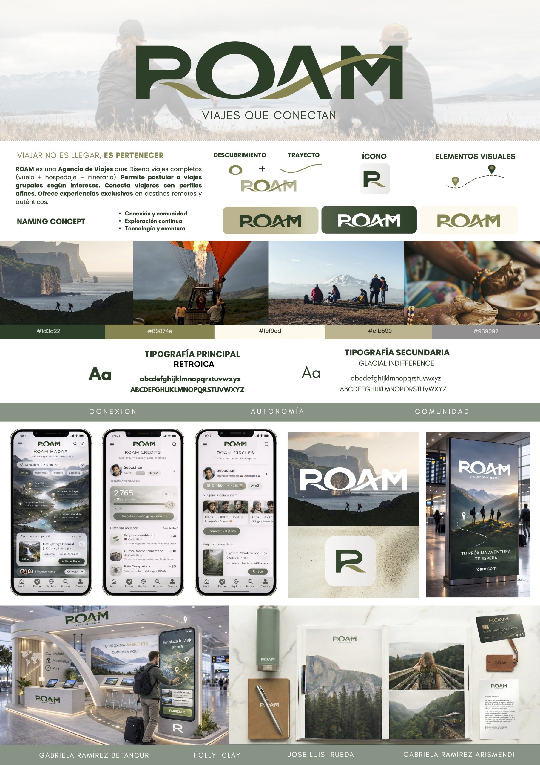
The strategic thinking behind ROAM is expressed through restraint and intention. Its visual identity is built on a palette of natural, desaturated tones, sober, timeless and fully functional across digital environments, reflecting a brand that values depth over spectacle. This design discipline extends across every touchpoint of the platform, from the interface through which travelers discover their next destination, to the curation of the experiences themselves.
ROAM designs the conditions for genuine encounters, between the traveler and the territory, between movement and meaning, between a person and the version of themselves that only emerges far from the familiar
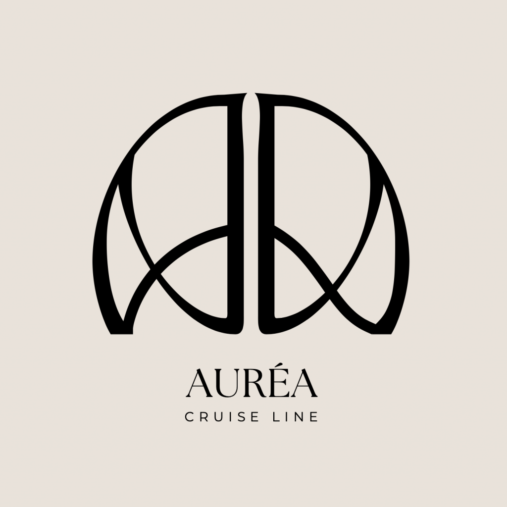
Auréa
AURÉA is a luxury adult-only cruise line designed exclusively for couples: a floating sanctuary in the Mediterranean where every detail is an act of romantic intention.
Its model is built on a belief as simple as it is powerful: love deserves to be celebrated with beauty and purpose. AURÉA does not sell cruises, it designs chapters in a couple’s story. The journey is structured as a narrative arc, unfolding across three movements: before, during and after, each activated through symbolic rituals, curated experiences and a private network of hosts that ensure no moment feels incidental. The bond does not end at the port; through community and anniversary rituals, AURÉA extends the experience well beyond the voyage itself.
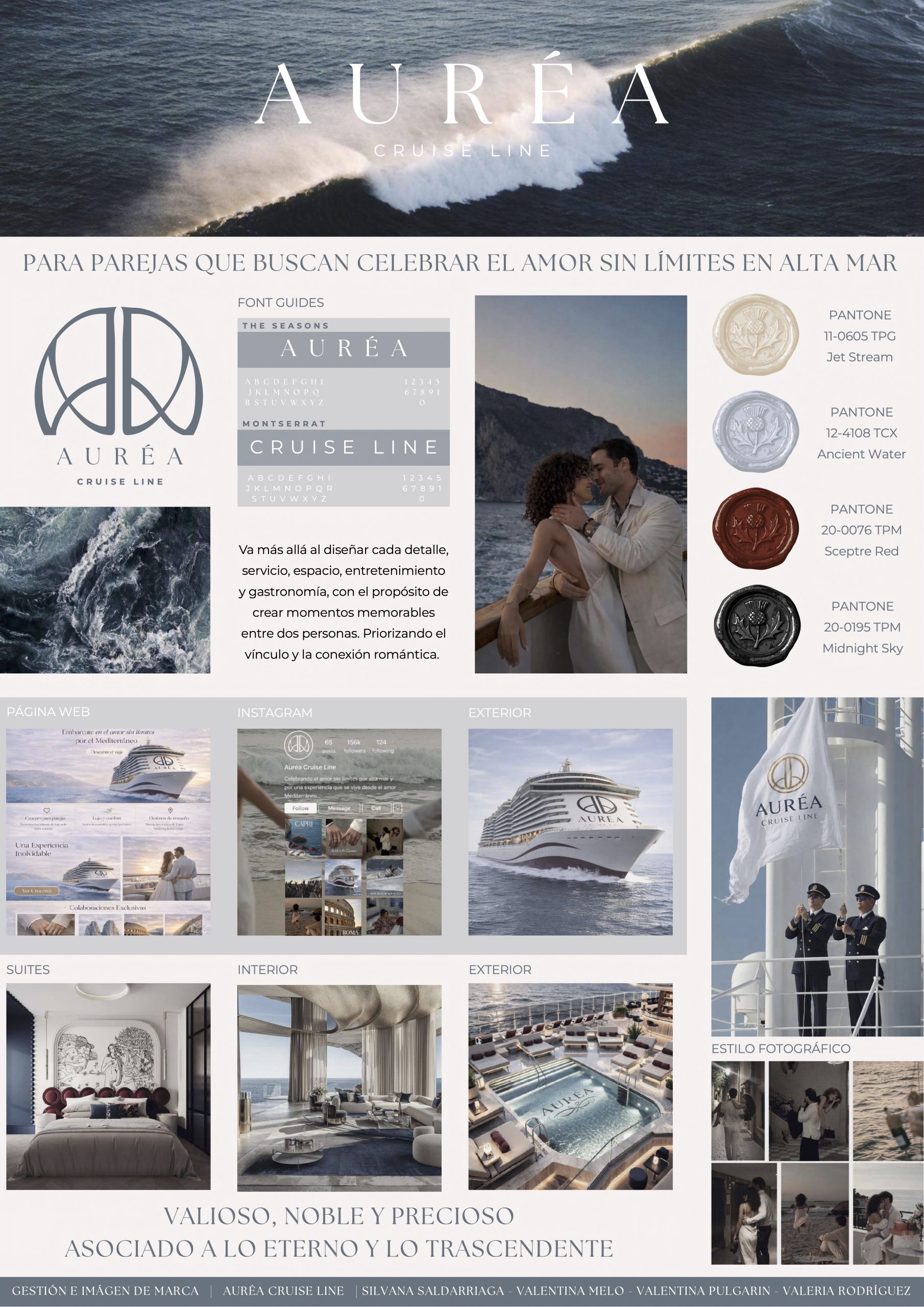
The strategic thinking behind AURÉA is embedded in every layer of its design practice. The interiors draw from the vocabulary of Art Deco (geometric elegance, rich materials, golden ratios and a sense of opulent intimacy) reinterpreted through a contemporary lens to create spaces that feel both timeless and deeply sensory. This aesthetic language flows directly into the brand identity, where the logotype is anchored by the whiplash line: that sinuous, organic curve that defined the decorative spirit of the era, here reimagined as a symbol of the couple’s intertwined journey. Sensory suites, symbolic celebrations and premium service become touchpoints in a carefully orchestrated emotional arc, where space, atmosphere and ritual converge to create genuine connection.
The result is a brand that operates as both a luxury product and an emotional proposition, one in which the Mediterranean backdrop becomes the stage, Art Deco becomes the visual soul, and the couple’s own story becomes the experience worth designing for.
Conclusion
Strategic Design as a Competitive Advantage in the Traveler Experience
Today’s traveler doesn’t choose a service — they choose an experience. And that experience is built, or broken, at every single touchpoint with the brand. That is why design is not an aesthetic matter; it is a strategic decision with a direct impact on business performance.
A coherent corporate identity, grounded in the brand’s real values and consistently expressed across every touchpoint, is what transforms a travel company into a brand with meaning. This alignment between identity, design, and experience builds trust before the purchase, satisfaction during the service, and advocacy after it.
Strategic design also has the power to anticipate: it proposes future scenarios, identifies friction points in the service, and opens paths of evolution that other disciplines simply cannot see. Companies that treat design as an investment, not a cost, are the ones that lead change, rather than react to it.
Travelers was developed within an academic framework, but with the exact same methodological rigor, tools, and team management that the professional world demands. Every design decision, from brand architecture to touchpoint definition, was driven by strategic business criteria, not theoretical exercises. The outcome is a project ready for immediate execution: actionable, scalable, and market-ready.
CREDITS
Project leader: Ivan Vidal.
Designers: 2026 DMAD School – Global Design Master students by projects:
FOR_ Airlines Ana Valeria Peralta Nava, Ariana Anabel Ghelli, Bryan Alexander Escalante Sosa, Ciro Andrés Chacón Núñez, Daniela Mercado Sandoval.
ROAM Travel experiences Gabriela Ramirez Betancur, Gabriela Estefania Ramirez Arismendi, Holly Blaire Clay, Jose Luis Rueda Flores Fahl.
Q`Ori Hotels Juliette Luevano Ceja, Karina Rincon Garcia, Karina Nicole Recoba Ugarte, Lina Marcela Landgraf Zuñiga, Lizeth Paulina Erazo Peñafiel.
aMara Lounge Luisa Fernanda Morales Bello, Maria De Los Angeles Llamoza Ochoa, Maria Fernanda Ortiz Diaz, Mariana Cordero Mantilla, Nicte Bautista Fuentes.
AURÉA Cruise line Silvana Saldarriaga Calixto, Valentina Pulgarin Patiño, Valentina Melo Icardo, Valeria Rodriguez Lozano.